In this post, the process for retroactively identifying and graphing a HTTPS DDoS of service condition is described. Why do we care about graphing, because it can be a great way to describe data to folks that may not be interested in looking at it in a tabular form, e.g. leadership. The specific example will use data collected from the server this blog is hosted on. If you are following along, this post assumes you have SiLK deployed in some manner and are collecting HTTP or similar traffic. Technically a DDoS condition did not occur (only two hosts were making a large number of requests) but blitz.io was used to exceed the network traffic this website typically experiences for sake of example. If a true DoS condition occurred, it would appear differently as the sensor is hosted on the same node therefore it would not record the surge in traffic. In order to record a true DoS, the sensor would ideally be placed upstream in the carrier or somewhere that exceeds the devices being monitored capacity. I would like to thank network defense analyst Geoffrey Sanders for providing R langauge as well as statistical recommendations in order to improve data analysis and graphical representations.
If we would like to retroactively search for anomaly in traffic volume, we can query a number of days and look for unusual spikes:
for DAY in {1..31}; do
    if [ ${DAY} -le 9 ]; then
        DAY=0${DAY}
    fi

    RESULT=$(rwfilter --start-date=2015/07/${DAY} --end-date=2015/07/${DAY} --dport=443 --pass=stdout --type=all|rwuniq --fields=dport,proto -
-values=records --no-col --no-final-del --no-title --packets=20-)

    echo "2015/07/${DAY}|${RESULT}" >> http.out

done
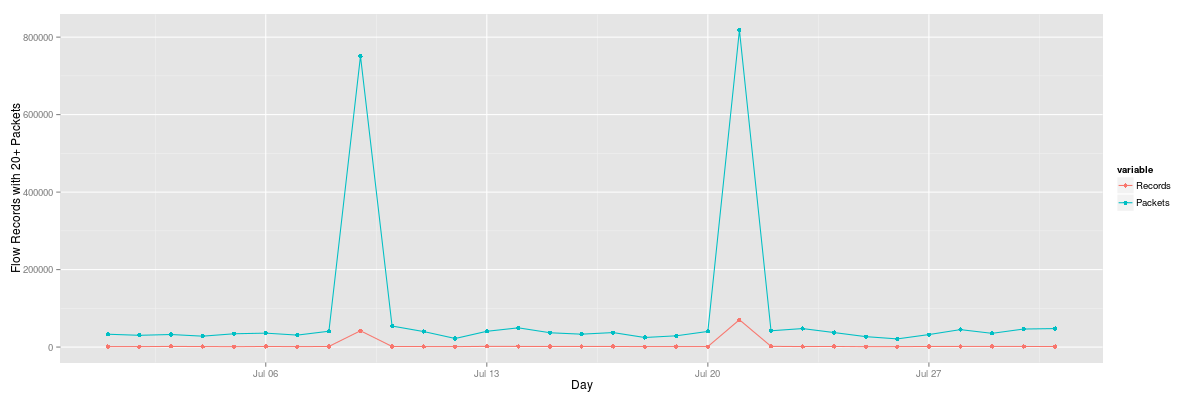
On the 21st, we see a large number of requests that significantly exceed other days:
2015/07/01|443|6|1443|33287
2015/07/02|443|6|1271|30583
2015/07/03|443|6|1776|32622
2015/07/04|443|6|1498|28316
2015/07/05|443|6|1124|34428
2015/07/06|443|6|1672|36113
2015/07/07|443|6|1298|31087
2015/07/08|443|6|1629|40990
2015/07/09|443|6|42005|750922
2015/07/10|443|6|1656|54450
2015/07/11|443|6|1464|40205
2015/07/12|443|6|1279|22251
2015/07/13|443|6|1884|40887
2015/07/14|443|6|1724|49821
2015/07/15|443|6|1635|37133
2015/07/16|443|6|1653|33433
2015/07/17|443|6|1695|37580
2015/07/18|443|6|1301|24899
2015/07/19|443|6|1445|29230
2015/07/20|443|6|1314|40543
2015/07/21|443|6|70533|817855
2015/07/22|443|6|1909|42257
2015/07/23|443|6|1462|47961
2015/07/24|443|6|1705|37581
2015/07/25|443|6|1150|27093
2015/07/26|443|6|1208|21267
2015/07/27|443|6|1597|32414
2015/07/28|443|6|1714|45208
2015/07/29|443|6|1702|35607
2015/07/30|443|6|1710|46748
2015/07/31|443|6|1514|47915
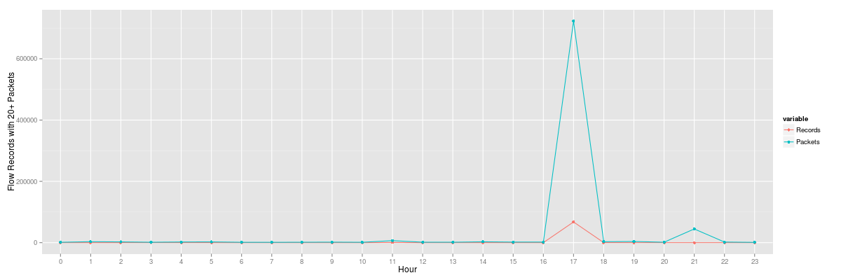
We can use a similar query broken down by hour for the questionable day:
for HOUR in {0..23}; do if [ ${HOUR} -le 9 ]; then
        HOUR=0${HOUR}
    fi

    RESULT=$(rwfilter --start-date=2015/07/21:${HOUR} --end-date=2015/07/21:${HOUR} --dport=443 --pass=stdout --type=all|rwuniq --fields=dport
,proto --values=records --no-col --no-final-del --no-title --packets=20-)

    echo "${HOUR}|${RESULT}" >> http-hour.out

done
The results from the hourly query clearly depict when the surge of HTTPS traffic volume occurred. From here, an analyst may run more specific queries to determine if it is indeed a distributed attack or sourced from only a few nodes.
00|443|6|72|1392
01|443|6|48|3203
02|443|6|151|2605
03|443|6|173|1612
04|443|6|125|2318
05|443|6|149|2622
06|443|6|72|1450
07|443|6|71|1294
08|443|6|73|1524
09|443|6|76|1881
10|443|6|67|1412
11|443|6|823|6720
12|443|6|60|1639
13|443|6|65|1511
14|443|6|72|2987
15|443|6|121|2061
16|443|6|69|2135
17|443|6|67562|722727
18|443|6|203|3222
19|443|6|112|4004
20|443|6|99|1526
21|443|6|122|44746
22|443|6|94|2129
23|443|6|54|1135
We can represent the tabular data from the daily and hourly queries using R Project and ggplot2. For the daily plot example, add a header day|dPort|protocol|Records|Packets to the dataset and run Rscript filename.r dataset.dat replacing the command directives with the script below and your dataset:
library(ggplot2)
library(reshape2)

options("scipen"=100, "digits"=4)
fname <- commandArgs(trailingOnly = TRUE)[1]
flowrecs <- read.table(fname, header = TRUE, sep = "|")
flowrecs$day <- as.Date(flowrecs$day, "%Y/%m/%d")
test_data_long <- melt(flowrecs, id.vars=c("day", "dPort", "protocol"))

flow.plot <- ggplot(data=test_data_long,
    aes(x=day, y=value, colour=variable))
    geom_line() + geom_point() + xlab("Day") + ylab("Flow Records with 20+ Packets")
    ggtitle(paste("Flow Records by Destination Port"))

png("plot.png", width=1200, height=400)
plot(flow.plot)
dev.off()
Which should provide a graphical representation similar to:
Similarly, we can do the same thing with the hourly plot by specifying the correct header of hour|dPort|protocol|Records|Packets and rerunning Rscript in the same manner as the daily plot.
library(ggplot2)
library(reshape2)

options("scipen"=100, "digits"=4)
fname <- commandArgs(trailingOnly = TRUE)[1]
flowrecs <- read.table(fname, header = TRUE, sep = "|")
flowrecs$hour <- factor(flowrecs$hour, levels=unique(flowrecs$hour))
test_data_long <- melt(flowrecs, id.var=c("hour", "dPort", "protocol"))

flow.plot <- ggplot(data=test_data_long,
    aes(x=hour, y=value, colour=variable, group=variable)) +
    geom_line() + geom_point() + xlab("Hour") + ylab("Flow Records with 20+ Packets")
    ggtitle(paste("Flow Records by Destination Port"))

png("plot.png", width=1200, height=400)
plot(flow.plot)
dev.off()
This depicts the two large sets of requests we had in the single day:
We can use rwstats in order to take a look at our top talkers if we are aware of congestion or other signs that the uniformity of visitors has changed. This query is a little artificial though. It is very possible that the source attacks may come from hundreds or even thousands of bots or some reflection mechanism depending on the service. If that is the case, we may have to look at other tuples or the actual request in order to determine a similarity between the distributed attack sources.
$ rwfilter --start-date=2015/7/21 --end-date=2015/7/21 --dport=443 --pass=stdout --type=all|rwstats --fields=sip --count=10 --no-col --no-final-del
INPUT: 70533 Records for 551 Bins and 70533 Total Records
OUTPUT: Top 10 Bins by Records
sIP|Records|%Records|cumul_%
54.173.173.209|33704|47.784725|47.784725
54.86.98.210|33698|47.776218|95.560943
162.243.196.54|742|1.051990|96.612933
180.76.15.142|97|0.137524|96.750457
68.180.230.230|75|0.106333|96.856790
180.76.15.140|37|0.052458|96.909248
72.80.60.139|31|0.043951|96.953199
66.249.67.118|31|0.043951|96.997150
180.76.15.136|24|0.034027|97.031177
63.254.26.10|23|0.032609|97.063786
We can append rwresolve in order resolve a specific IP field. We see two Amazon hosts whom are likely the Blitz.io bots as they comprise 96% of the traffic for the defined time threshold:
$ rwfilter --start-date=2015/7/21 --end-date=2015/7/21 --dport=443 --pass=stdout --type=all|rwstats --fields=sip --count=10 --no-col --no-final-del|rwresolve --ip-fields=1
INPUT: 70533 Records for 551 Bins and 70533 Total Records
OUTPUT: Top 10 Bins by Records
sIP|Records|%Records|cumul_%
ec2-54-173-173-209.compute-1.amazonaws.com|33704|47.784725|47.784725
ec2-54-86-98-210.compute-1.amazonaws.com|33698|47.776218|95.560943
162.243.196.54|742|1.051990|96.612933
baiduspider-180-76-15-142.crawl.baidu.com|97|0.137524|96.750457
b115504.yse.yahoo.net|75|0.106333|96.856790
baiduspider-180-76-15-140.crawl.baidu.com|37|0.052458|96.909248
pool-72-80-60-139.nycmny.fios.verizon.net|31|0.043951|96.953199
crawl-66-249-67-118.googlebot.com|31|0.043951|96.997150
baiduspider-180-76-15-136.crawl.baidu.com|24|0.034027|97.031177
mail.oswaldcompanies.com|23|0.032609|97.063786
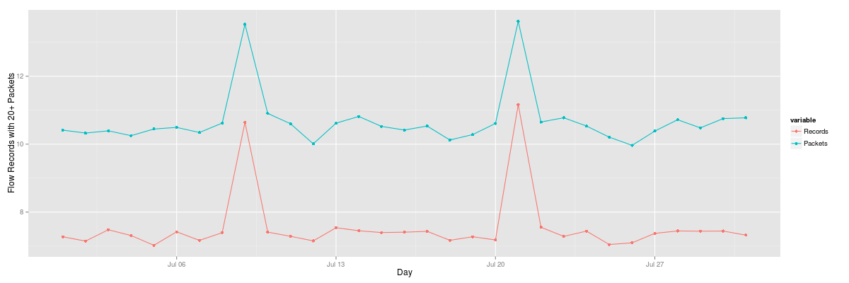
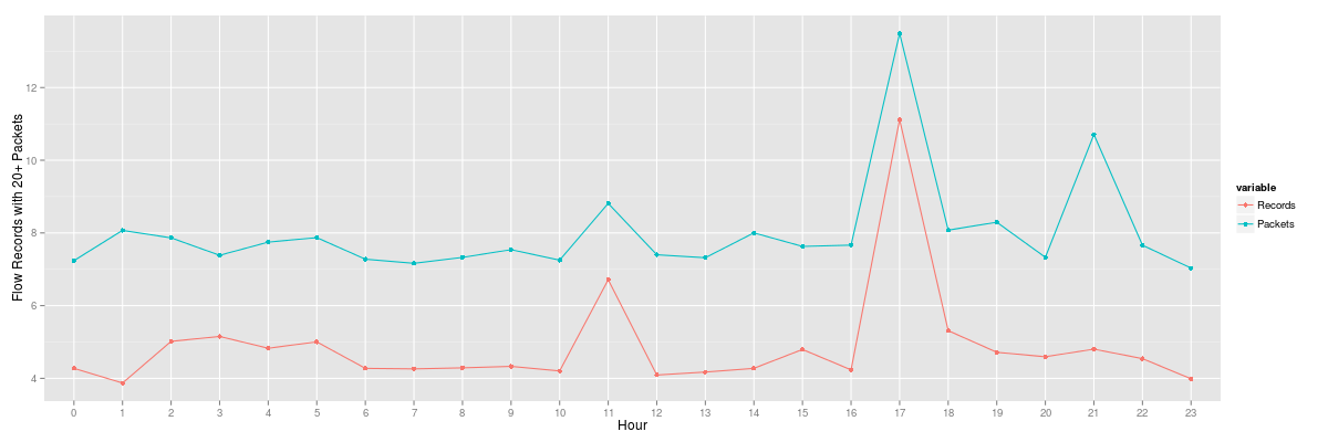
Both of the graphs above describe the anomalous traffic but our normal traffic is no longer clear. One way we can provide a more clarification is to use statistics in order to more effectively describe the data because of the significant outliers. In order to achieve this, we will first use a log function in order to describe the data volumes. We use the same scripts as earlier, but change y=value to y=log(value).
While using a log function provided an improvement, it may not provide an accurate representation of volume data types. Next, we will take a look at percentiles with R. Our data frame is composed of three days. The middle being the 21st which contains our fictitious DoS attack.
> mydata
      [,1]   [,2] [,3]
 [1,] 1252   1392 1551
 [2,] 1347   3203 1969
 [3,]  749   2605 1642
 [4,] 2232   1612 1432
 [5,]  707   2318 1531
 [6,]  552   2622 1175
 [7,] 1072   1450 1981
 [8,]  487   1294 1606
 [9,] 1448   1524  959
[10,]  867   1881 1763
[11,]  903   1412 1283
[12,]  911   6720 3055
[13,] 1125   1639 3609
[14,] 1511   1511 1977
[15,] 1792   2987 2476
[16,]  912   2061 1722
[17,] 1114   2135  655
[18,]  424 722727 1338
[19,] 3888   3222 4038
[20,] 3646   4004 1765
[21,] 9281   1526 1650
[22,] 1590  44746 1190
[23,] 1131   2129 1190
[24,] 1602   1135  700
Here is how we get to our graph in the R console:
mydata <- matrix(ncol=24, nrow=3)
mydata <- matrix(df$Packets, ncol=3, nrow=24)
dataout <- apply(mydata, 1, quantile, probs=c(0.05, 0.5, 0.90))
ylim=range(500,5000)
plot(seq(ncol(dataout)), dataout[1,], t="l", lty=2, ylim=ylim, main="Flow Percentiles", xlab="Hour",
ylab="Packets") #5%
lines(seq(ncol(dataout)), dataout[2,], lty=1, lwd=2) #50%
lines(seq(ncol(dataout)), dataout[3,], lty=2, col=2)  #90%
legend("topleft", legend=rev(rownames(dataout)), lwd=c(1,2,1), col=c(2,1,1), lty=c(2,1,2))
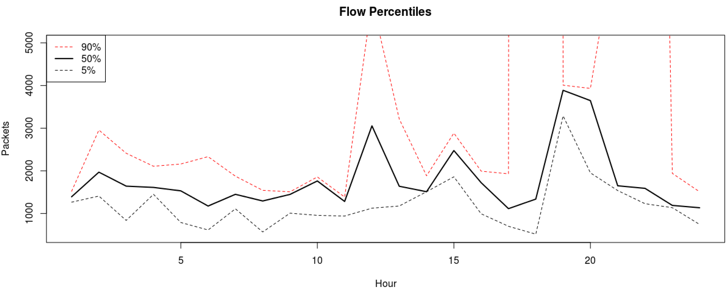
The 90th percentile really stands out here but having to use y limit to see our lower percentiles prevents us from seeing the whole picture. Let us graph both again but splitting our lower and upper bounds.
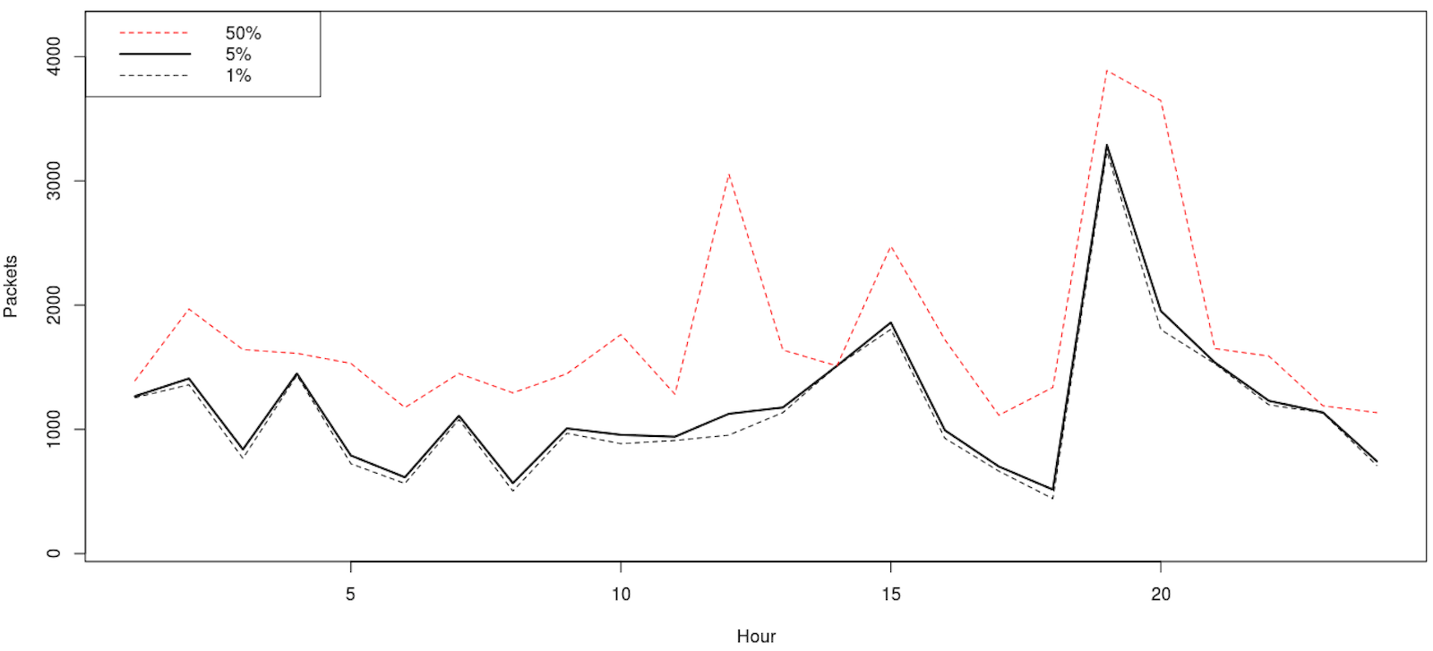
mydata <- matrix(ncol=24, nrow=3)
mydata <- matrix(df$Packets, ncol=3, nrow=24)
dataout <- apply(mydata, 1, quantile, probs=c(0.01, 0.05, 0.5))
ylim=range(100,4200)
plot(seq(ncol(dataout)), dataout[1,], t="l", lty=2, ylim=ylim, main="Flow Percentiles", xlab="Hour", ylab="Packets") #1%
lines(seq(ncol(dataout)), dataout[2,], lty=1, lwd=2) #5%
lines(seq(ncol(dataout)), dataout[3,], lty=2, col=2)  #50%
legend("topleft", legend=rev(rownames(dataout)), lwd=c(1,2,1), col=c(2,1,1), lty=c(2,1,2))
mydata <- matrix(ncol=24, nrow=3)
mydata <- matrix(df$Packets, ncol=3, nrow=24)
dataout <- apply(mydata, 1, quantile, probs=c(0.90, 0.95))
ylim=range(dataout)
plot(seq(ncol(dataout)), dataout[1,], t="l", lty=2, ylim=ylim, main="Flow Percentiles", xlab="Hour", ylab="Packets") #90%
lines(seq(ncol(dataout)), dataout[2,], lty=1, lwd=2) #95%
legend("topleft", legend=rev(rownames(dataout)), lwd=c(1,2,1), col=c(2,1,1), lty=c(2,1,2))
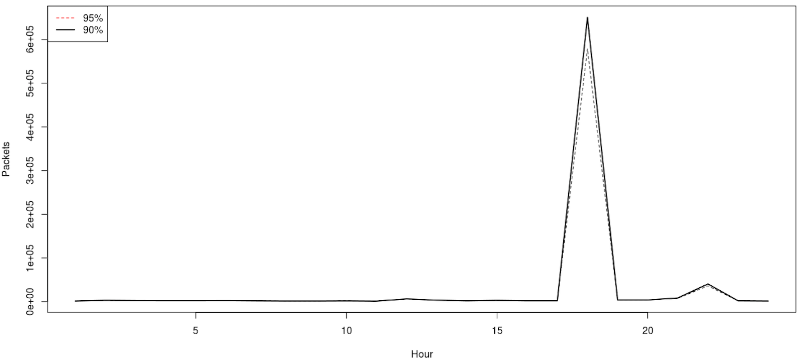
This is a better analytical view. We can infer that if we see traffic at the 90 percentile, likely something is off. For the heck of it, let us see how the percentiles compare to the mean and median, the former not being necessary as we already included it in the percentile two examples above but nevertheless.
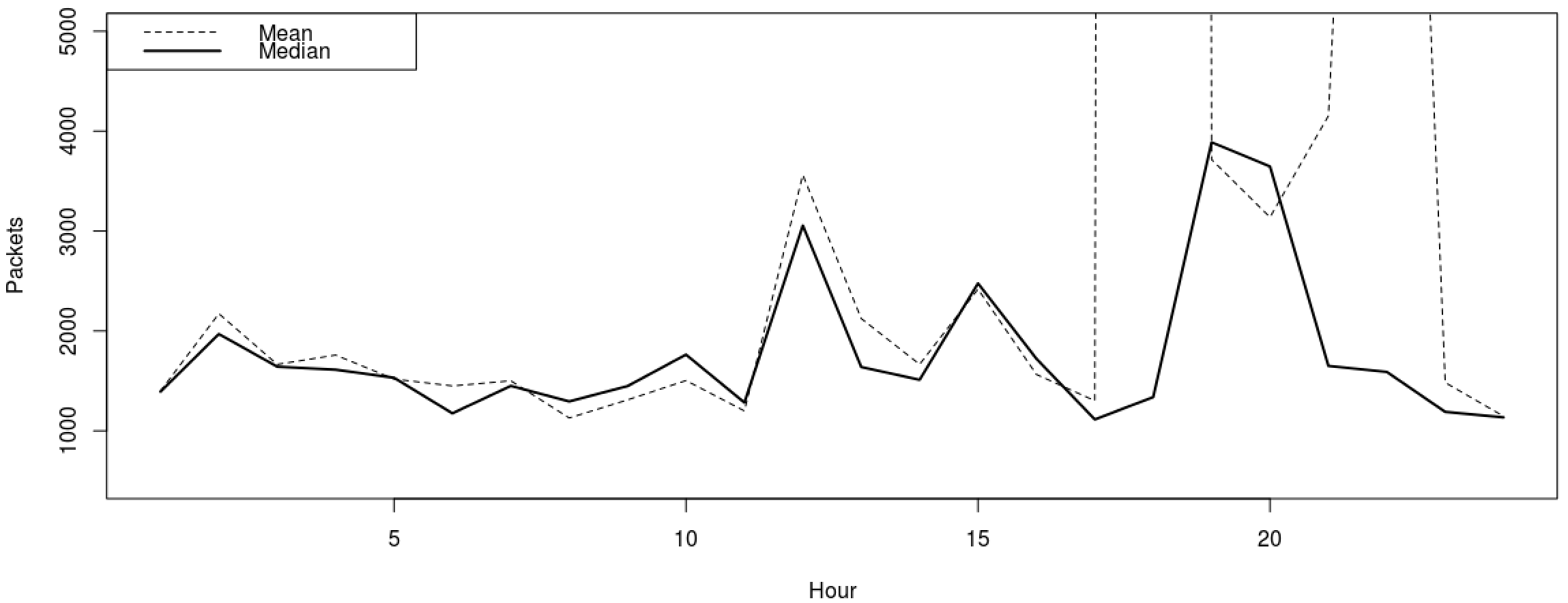
ylim=range(500,5000)
mydata <- matrix(ncol=24, nrow=3)
mydata <- matrix(df$Packets, ncol=3, nrow=24)
meandata <- apply(mydata, 1, mean)
mediandata <- apply(mydata, 1, median)
plot(meandata, t="l", lty=2, ylim=ylim, main="Flows", xlab="Hour", ylab="Packets")
lines(mediandata, lty=1, lwd=2)
legend("topleft", legend=c("Mean", "Median"), lwd=c(1,2), col=c(1,1), lty=c(2,1))
The tabular data outliers are obvious but we will graph it. Based on this, we could leverage around 5 to 10 percentile for normal traffic but much larger sampling would need to take place as we only used three days.
> meandata
 [1]   1398.333   2173.000   1665.333   1758.667   1518.667   1449.667
 [7]   1501.000   1129.000   1310.333   1503.667   1199.333   3562.000
[13]   2124.333   1666.333   2418.333   1565.000   1301.333 241496.333
[19]   3716.000   3138.333   4152.333  15842.000   1483.333   1145.667
> mediandata
 [1] 1392 1969 1642 1612 1531 1175 1450 1294 1448 1763 1283 3055 1639 1511 2476
[16] 1722 1114 1338 3888 3646 1650 1590 1190 1135
Last but not least, we are going to take a look at a tool the NetSA team has developed for graphically representing data named Rayon. I will provide a quick reference, but you can find more details here and here. As with R language, the outliers distort the graph so we use log functions for the second and third graphs in order to minimize the outlier effects. First, grab the data we are interested in:
$ rwfilter --start-date=2015/7/21 --end-date=2015/7/21 --dport=443 --proto=6 --type=inweb --pass=httpsin.bin
$ rwfilter --start-date=2015/7/21 --end-date=2015/7/21 --dport=443 --proto=6 --type=outweb --pass=httpsout.bin
Next, export the values we need, we provide a snippet of our data:
$ rwcount --bin-size=300 --no-titles --delimited httpsin.bin|awk -F\| '{printf("%s|%s|in\n", $1, $3)}' > 2-top.txt
--snip--
2015/07/21T00:00:00|5003.00|in
2015/07/21T00:05:00|16677.47|in
2015/07/21T00:10:00|4814.53|in
2015/07/21T00:15:00|4951.00|in
2015/07/21T00:20:00|1440.00|in
2015/07/21T00:25:00|10055.00|in
2015/07/21T00:30:00|5410.06|in
2015/07/21T00:35:00|1356.94|in
2015/07/21T00:40:00|4346.32|in
2015/07/21T00:45:00|10125.04|in
2015/07/21T00:50:00|7178.64|in
2015/07/21T00:55:00|16766.00|in
--snip--

$ rwcount --bin-size=300 --no-titles --delimited httpsout.bin|awk -F\| '{printf("%s|%s|out\n", $1, $3)}' > 2-btm.txt
--snip--
2015/07/21T00:00:00|60615.00|out
2015/07/21T00:05:00|317387.87|out
2015/07/21T00:10:00|214138.13|out
2015/07/21T00:15:00|60527.00|out
2015/07/21T00:20:00|3500.00|out
2015/07/21T00:25:00|76385.00|out
2015/07/21T00:30:00|77113.44|out
2015/07/21T00:35:00|32326.56|out
2015/07/21T00:40:00|39375.58|out
2015/07/21T00:45:00|96888.67|out
2015/07/21T00:50:00|30598.75|out
2015/07/21T00:55:00|313460.00|out
--snip--
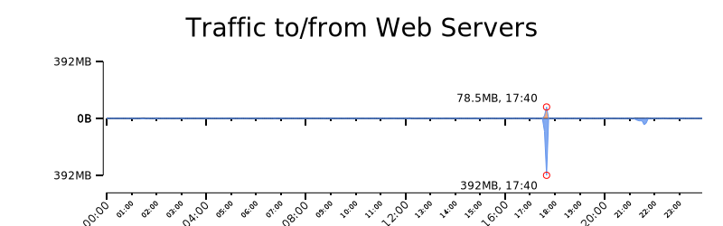
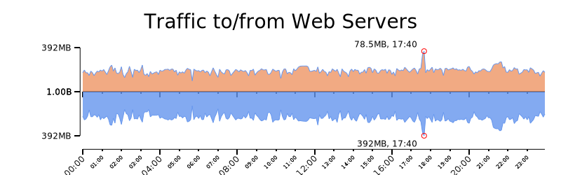
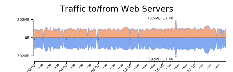
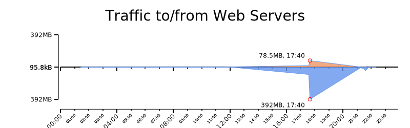
We graph the values with rwtimeseries. As expected, the incoming traffic is less than the outgoing HTTPS response. We adjusted the scale of the second and third graph using log, and the last Rayon graph describes data between the 95 and 100 percentiles.
$ cat 2-top.txt 2-btm.txt | rytimeseries --style=filled_lines --output-path=2.png --top-filter="[2]==in" --bottom-filter="[2]==out" --top-column=1 --bottom-column=1 --annotate-max --value-tick-label-format=metric --value-units=B --title="Traffic to/from Web Servers" --value-scale=linear
$ cat 2-top.txt 2-btm.txt | rytimeseries --style=filled_lines --output-path=2.png --top-filter="[2]==in" --bottom-filter="[2]==out" --top-column=1 --bottom-column=1 --annotate-max --value-tick-label-format=metric --value-units=B --title="Traffic to/from Web Servers" --value-scale=log --`fix-scale-min=1
$ cat 2-top.txt 2-btm.txt | rytimeseries --style=filled_lines --output-path=2.png --top-filter="[2]==in" --bottom-filter="[2]==out" --top-column=1 --bottom-column=1 --annotate-max --value-tick-label-format=metric --value-units=B --title="Traffic to/from Web Servers" --value-scale=clog
$ cat 2-top.txt 2-btm.txt | rytimeseries --style=filled_lines --output-path=2.png --top-filter="[2]==in" --bottom-filter="[2]==out" --top-column=1 --bottom-column=1 --annotate-max --value-tick-label-format=metric --value-units=B --title="Traffic to/from Web Servers" --value-scale=linear --value-min-pct=90 --value-max-pct=95
There you go. A quick and dirty way to identify traffic surges to whatever services you have sitting behind your collector. Please leave any questions you have regarding this post below.
Comments
comments powered by Disqus